
Isometric Fantasy
- Laslie Cooper

- May 6, 2025
- 2 min read
Updated: Jul 1, 2025
Why I Switched to Isometric View for My Fighting Fantasy Maps
(and why that’s not changing anytime soon)

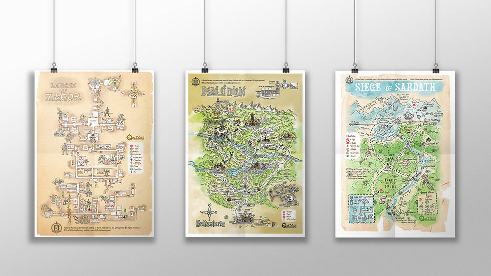
It all started with House of Hell. That map was my first full isometric attempt, and both I and many Fighting Fantasy fans absolutely loved it. It’s one of my personal favorite books in the series, so it felt fitting to give it extra depth — literally. The response was so positive, I knew I had to keep going in this direction.


For years, I drew my Fighting Fantasy maps in a classic top-down view. You know the style: straight corridors, simple rooms, everything laid out like a board game. It worked, and it was fast! I only had to focus on logic and layout.
But recently, something changed. Maybe I got bored. Maybe I wanted a challenge. Or maybe my dungeon-loving heart just craved more depth.
So I gave isometric view a try.

And wow, what a difference! Suddenly, rooms had height. Stairs looked like actual stairs. Towers became towers. The world didn’t just exist, it rose up.
Of course, it’s a lot more work. Every detail has to follow the weird rules of fake 3D. But the result? Totally worth it.
Out of my last seven maps, five are already fully isometric.
I still draw everything by hand (yes, line by line), then carefully color it, and sometimes vectorize it too. The result looks somewhere between an architectural sketch and an old-school video game.

Will I abandon top-down completely? Probably not. It still has its charm. But right now, the isometric style gives me more freedom, not just to map the world, but to show it.
Scroll down and see for yourself. Same books. Same monsters. Same deadly mazes, just from a whole new angle.
The world of fantasy is looking up. Literally.


Comments